
NAMI Indicator Guide
What is NAMI?
NAMI is the first composite momentum indicator that plots price action momentum with absolute zero lag - zero drag - with the ability to see price action in this manner, the reader's ability to identify tops, bottoms and divergences becomes effortless. Throughout this guide, you will learn all of NAMI’s components.
The user guide will be sectioned by each component that makes NAMI. (See below)
- (Key) NAMI Momentum Wave
- Stochastic and RSI Crossovers
- Stochastic Bubble
- Money Flow Index
Section 1.0 - NAMI Momentum Wave
NAMI MOMENTUM WAVE
NAMI’s algorithmic momentum wave is a proprietary momentum oscillator that plots price action in the form of oscillating waves. (Do not confuse NAMI as an RSI, VWAP or stochastic equivalent; we encourage anyone to make comparisons as they will come to find that NAMI is a beast of its own.)
Key Features:
- Plots price action momentum with virtual zero lag
- Momentum wave size and depth factors based on price volatility and volume
- Displays momentum divergences with absolute clarity

EXHIBIT 1.1 - Ethereum 5HR
On this Ethereum 5-hour chart (exhibit 1.1), you can see price made lows on the 7th and 9th and a top on the 8th of January. (The tops and bottoms are signified with sharp pointed ends with red and green dots.) When the second bottom forms with the green dot, a visibly clear hidden bullish divergence is formed resulting in a 20% move up. (During uptrends, hidden bullish divergences are constantly formed and in a way validates a continued uptrend; the same applies when price is in a downtrend.)
On the counter-end, when price nears the top (third wave, red dot on the 100 line, on the large momentum wave), we see price retrace forming a bottom on the 11th, and a final top on 12th of January. That confirmed red dot on the 12th also confirmed a powerful bearish divergence which pushed price down, breaking higher timeframe market structure.
We use NAMI everyday looking for these printed signals and divergences. It is critically important that you have all your support, resistances, imbalances and liquidity objectives marked out to use as confluence with NAMI.

EXHIBIT 1.2 - Ethereum 5HR Market Cipher B Comparison Chart
Here in exhibit 1.2, we will compare NAMI to Market Cipher B in the same chart as exhibit 1.1
In short, the key differences are:
- Market Cipher’s initial wave is 10 hours behind NAMI’s initial wave
- Where NAMI was able to visualize a price floor that created the hidden bullish divergence – Market Cipher fails to plot the second momentum wave.
- Nami visualizes 3 waves during the uptrend and prints the final top 5 hours before Market Cipher.
- Market Cipher fails to plot the retracement bottom completely on the 11th of January.
- Market Cipher fails to plot the final momentum top that NAMI did, creating the bearish divergence.
Note:
We are not cherry picking charts here to make these comparisons– view any asset on any timeframe and you will see this repeat over and over – and over.
Simply put, other composite indicators out in the market are slow and inaccurate. These products confuse market observers with smooth, undulating blobs but unfortunatel the market is not that smooth nor bubbly - it is sharp, impulsive and reactive and this is what NAMI captures then visualizes instantaneously.
Section 2.0 - Stochastic and RSI Crossover
STOCHASTIC AND RSI CROSSOVER
This feature of NAMI displays the stochastic (green and red) and RSI (yellow) oscillating within the dashed red line at 150(top) and 50(bottom). The 150 line and 50 line is the window in which this feature operates and the 100 line is to be used as the center point.

EXHIBIT 2.1 - Ethereum 1HR
Key Features:
- Stochastic will turn green when it crosses up the yellow RSI; price direction is up
- Stochastic will turn red when it crosses down the yellow RSI; price direction is down
- When the green stochastic reaches the top line (150), this means the asset is overbought
- When the red reaches the bottom line (50), this means the asset is oversold
- The stochastic can ride the top and bottom when there are extreme buying or selling pressure
How to Use:
In exhibit 2.1, the green stochastic tagged the 150 line and crossed under the RSI, turning the line red. At this point, price topped and sold off and rode the 50 line for many hours. When the red stochastic finally flips the RSI, the selling pressure is released and price finds a local bottom.
This feature is to provide the market observer with additional information and should be used in conjunction with all the other components of NAMI.
Section 3.0 - Stochastic Bubble
STOCHASTIC BUBBLE
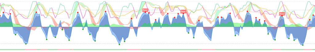
NAMI’s Stochastic Bubble overlay is a way to view price trends on any time frame. The bubble can show viewers tops, bottoms, divergences, uptrends and downtrends.
Key Features:
- Identifying key price trends (macro and micro)
- Providing macro and micro bullish or bearish bias
- Identifying overbought conditions (when it crosses above the 80 line)
- Identifying oversold conditions (when it crosses below the 20 line)
- Spotting divergences
How to use: (see below)
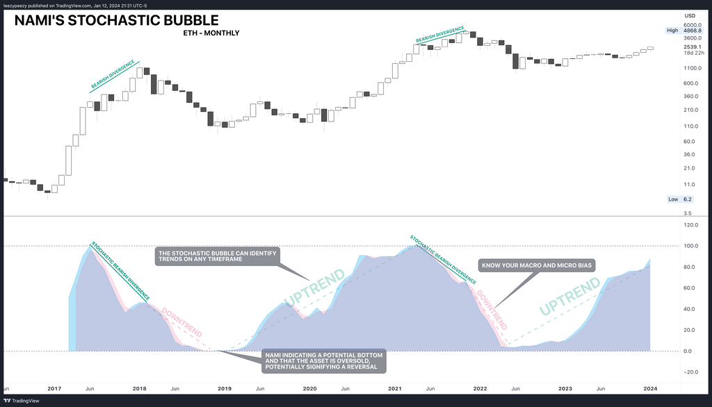
EXHIBIT 3.1 - Ethereum Monthly Time Frame (other components of NAMI was removed to isolate this feature for visibility)
On exhibit 3.1, you can see the Stochastic Bubble form a top that turns red - at the same time, price is consolidating sideways rather than moving in the downward direction of the bubble. However, when price impulses at the end of 2017, the stochastic forms a lower high, creating a bearish divergence; from which this point price reverses into a downtrend for an entire year. The bubble finally flips bullish when the Stochastic Bubble flips blue upwards near the end of the 2018.
Using the Stochastic Bubble on a weekly or monthly time frame can often provide a good macro bias. This is great for positioning yourself in the correct trend. Now let’s see how we can utilize this same concept on an hourly chart.

EXHIBIT 3.2 - Ethereum 1HR
In exhibit 3.2, price is in a macro uptrend - using the Stochastic Bubble, on the 8th of January, the bubble is at the overbought level yet when price kept trending upwards the bubble started showing weakness. This ultimately formed the bearish divergence and price retraced. For buyers, this bearish divergence is key in the sense that they can wait to enter the market at a discount level. For NAMI users, it is incredibly easy to spot the bullish divergences that signal market entry. Let’s see how we can use NAMI’s momentum waves on the exact same chart below.

EXHIBIT 3.3 - Ethereum 1HR with NAMI Momentum Waves
Now that we have turned on NAMI’s Momentum Waves, you can now see the divergences form with clarity. (The divergences are marked: 1, 2, and 3.) Within the span of three days, using NAMI, there were three dip buys available.
Section 4.0 - Money Flow Index
NAMI Money Flow Index
NAMI’s Money Flow Index (MFI) is the final component that makes NAMI. The MFI oscillates between green and red from the zero line and can give insight to the viewer the buying/selling pressure and volume for that particular asset.
Key Features:
- Buying and selling pressure
- Overbought and oversold conditions
- Divergences
How to Use:
- When the money flow crosses up and rises - this indicates buying pressure
- When the money flow crosses down and descends - this indicates selling pressure
- MFI can also create divergences with price action
- Use as confluence with other key NAMI features.

EXHIBIT 4.1
In exhibit 4.1, we highlighted the price action areas with the corresponding money flow on NAMI. Users can see there is very little delay with displaying the buying and selling pressure. Now let’s have fun and make comparisons with other indicators.

EXHIBIT 4.2 - Comparison with Market Cipher B (MCB)
Key Mentions:
- In this comparison, MCB money flow is significantly delayed - by the time the money flow crossed over positive, Ethereum took out it’s significant 2022 high
- NAMI money flow transition is immediate and after taking out the significant high, NAMI’s money flow starts to taper, meaning increased selling pressure
- MCB, even after the price started selling off, it’s money flow remained flat

EXHIBIT 4.3 - Additional Comparison (Ethereum 3 Day)
Key Mentions:
- NAMI’s money flow transitions without delay when buying pressure increased
- Market Cipher’s money flow takes 51 days to transition green within this same time frame
Section 5.0 - Conclusion
As demonstrated in the previous sections, NAMI, as a composite momentum indicator, is an incredible tool for traders looking for market entries and exits. The zero lag display of momentum alone is a winning indicator but with the addition of all the other components, it makes NAMI a sort of swiss army knife, if you will. But even with all tools, it ultimately boils down to the user and their experience. As a subscriber, you have access to the NAMI VIP Discord, where there are other experienced traders, books for download and tutorials available to further endeavor your journey. Thank you for being a member and if you have any questions, concerns or comments - please feel free to reach out to us at: info@nami-trading.com.